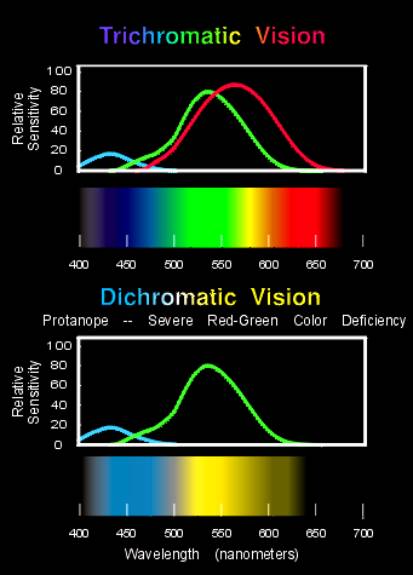
In its most severe forms, color blindness is caused by the absence of one of the cone visual pigments. Shown here, the spectral sensitives of the cone pigments in color normal trichromats are compared with those of a color blind person. Also compare the spectrum as it appears to a color normal person with the illustration of how it might look to a red-green color blind person.
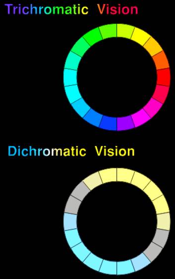
The difficulties with certain colors can be illustrated on a color wheel. For a severely red-green color blind person there are only two hues, the ones are a color normal person sees as yellow and blue. Intermediate colors, the ones seen as blueish-green and magenta, appear gray.
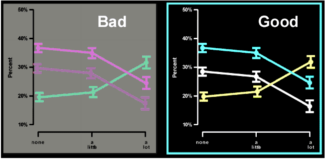
Clear graphics are very important and often the source of the most difficulty; here are two examples showing the differences between good and bad use of color. The Trick is to keep brightness differences large and to avoid color combinations that do not contrast well.
A comparison of the two color wheels shows which color combinations would be difficult to see. Graphics cause the most problems, but the colors can be economically illustrated as text examples, below. The right-hand column illustrates how the left hand column might look to a color blind person.
Trichromatic
Vision
Dichromatic
Vision
The text and backgrounds show at left are redrawn in this column as they might appear to a colorblind person
Blueish-Reds
and Blueish-Greens
This Would Not Be Very Visible
to a Person with Red-Green
Color Vision Deficiency
This Would Not Be Very Visible
to a Person width Red-Green
Color Vision Deficiency
Trichromatic
Vision
Dichromatic
Vision
The text and backgrounds show at left are redrawn in this column as they might appear to a colorblind person
This Would Not Be Very Visible to a Person
with Red-Green Color Vision Deficiency
This Would Not Be Very Visible to a Person
with Red-Green Color Vision Deficiency
This Would Not Be Very Visible to a Person
with Red-Green Color Vision Deficiency
This Would Not Be Very Visible to a Person
with Red-Green Color Vision Deficiency
Some examples of color combinations that are easily seen by a color blind person are shown below. These are illustrated as text examples but these principles are most important to keep in mind when preparing drawings, graphs, and figures.
Trichromatic
Vision
Dichromatic
Vision
The text and backgrounds show at left are redrawn in this column as they might appear to a colorblind person
Blues and Yellows Contrast Well
Keep Brightness Differences Large
Blues and Yellows Contrast Well
Keep Brightness Differences Large
Trichromatic
Vision
Dichromatic
Vision
The text and backgrounds show at left are redrawn in this column as they might appear to a colorblind person